Color
The Quiet Power of a Color Palette You Can Live With
You do not need ten colors. You need three that work together everywhere — and that match your interior design style. Here is a simple framework for choosing them, and the ratio that makes them sing.
Color is where a lot of decorating confidence goes to die. There are too many options, and a wrong choice feels expensive to undo. But a cohesive home almost always runs on a surprisingly small palette — a handful of colors repeated with intention from room to room.
The 60-30-10 rule
One of the oldest tricks in design is also one of the most reliable. Give about sixty percent of a room to a dominant, usually quiet color — walls, large furniture, the floor. Give thirty percent to a secondary color that adds contrast. Save the last ten percent for an accent: the pillows, the art, the one bold object that earns its keep.
- 60% — your foundation. Soft, livable, easy to spend hours with.
- 30% — your supporting color. Enough contrast to add interest without competing.
- 10% — your accent. This is where you get to be brave.
Borrow from a neutral backdrop
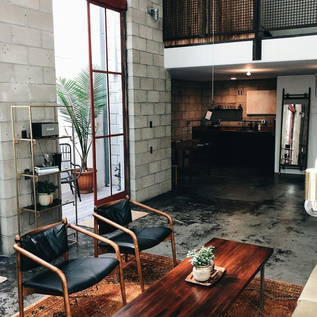
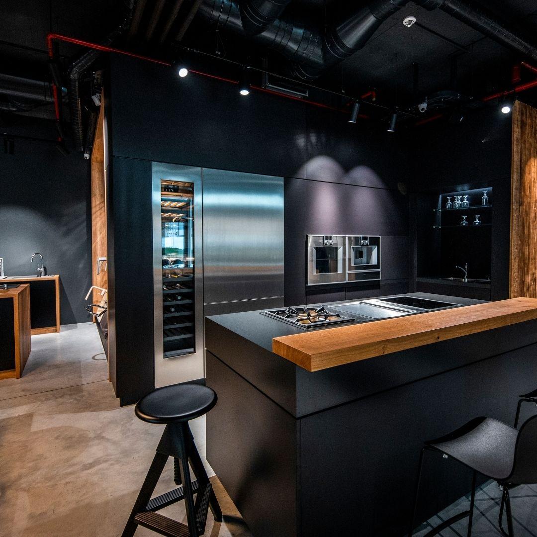
Timeless rooms often lean on a neutral base — white, beige, cream, linen, soft browns and blacks — and then bring personality through texture and a single confident accent. A neutral foundation is forgiving: it lets you change the ten percent with the seasons without repainting a thing.